
Have you ever considered how your design choices shape the way others perceive you professionally? In today’s digital world, your online presence often serves as the first impression. A well-crafted design can speak volumes before anyone reads a single word.
From logos to layouts, every choice contributes to your professional identity. Consistent design helps build recognition and trust, making it easier for others to connect with your story. Think of global brands like FedEx or Panera Bread—their cohesive design reinforces their strength and reliability.
This article will guide you through creating, optimising, and maintaining a design that reflects your unique professional brand. Whether you’re building a personal or corporate identity, the right design choices can make all the difference.
Key Takeaways
- Thoughtful design choices create a strong first impression.
- Consistency in design builds recognition and trust.
- Professional logos and layouts enhance your identity.
- Global brands use design to reinforce their strength.
- This guide will help you optimise your professional design.
Understanding the Importance of Visual Elements in Branding
Have you ever wondered how a single image can shape your professional story? In today’s digital landscape, visuals are more than just decorations—they are powerful tools that communicate your brand’s identity and values. From logos to photos, every detail plays a role in how your audience perceives you.
Exploring the Role of Visual Elements
Visuals go beyond logos. They create continuity across all your communications. For example, a consistent colour palette can make your brand instantly recognisable. Studies show that colours increase brand recognition by up to 80%. This is why global brands like Coca-Cola and Apple rely on their signature hues to stand out.
Images and photos also contribute to your strategic narrative. They tell stories that words alone cannot. A well-chosen image can evoke emotions, build trust, and leave a lasting impression. Think of Nike’s iconic swoosh or Starbucks’ green mermaid—these visuals are etched into our minds.
Brand Identity and Consumer Perception
Your strategy should align visuals with your brand’s personality. For instance, bold colours and dynamic shapes might suit a youthful, energetic brand, while muted tones and clean lines could reflect sophistication. Consistency is key. Brands that maintain visual coherence across platforms see up to 23% higher revenue.
Take McDonald’s as an example. Their golden arches and red-and-yellow colour scheme are instantly recognisable worldwide. This consistency reinforces their identity and builds trust with consumers. When your visuals align with your messaging, you create a seamless experience that resonates with your audience.
In summary, visuals are not just about aesthetics—they are a cornerstone of your brand’s identity. By carefully choosing and consistently applying them, you can craft a professional story that leaves a lasting impact.
Crafting a Cohesive Visual Identity for Your LinkedIn Profile
How do you ensure your professional identity stands out in a crowded digital space? A cohesive visual identity is the key. It’s not just about looking good—it’s about creating a consistent and recognisable presence that reflects your values and expertise.
Establishing Your Brand Style Guide
A brand style guide is your blueprint for consistency. It ties together elements like your logo, font choices, and colour palette. These details ensure your content looks professional across all platforms, from your website to your social media profiles.
Why is this important? Consistency builds trust. When your audience sees the same style repeatedly, they associate it with reliability. For example, global brands like Coca-Cola and Apple use consistent visuals to reinforce their identity. You can do the same for your business.
Here’s how to create a comprehensive style guide:
- Define your brand colours and stick to them. This creates instant recognition.
- Choose fonts that reflect your personality—whether it’s modern, classic, or bold.
- Specify logo placement and sizing to maintain uniformity.
Tools like Visme can help you design an infographic style guide. This makes it easy to share and implement across your team. Remember, small details matter. Even the spacing between your logo and text can influence how your audience perceives your business.
“Consistency is the foundation of trust. A cohesive visual identity tells your audience you’re reliable and professional.”
By maintaining a unified look, you reinforce your brand story. This not only enhances your online presence but also makes it easier for potential employers and connections to understand your professional persona. For more insights, check out this detailed guide on visual branding.
Optimising Your LinkedIn Banner and Profile Pictures
What’s the first thing people notice when they visit your profile? It’s your banner and profile photo. These visuals set the tone for your professional identity. Ensuring they’re optimised is crucial for making a strong impression.
Ideal Dimensions and Resolution
To avoid pixelation, use the correct dimensions. Your banner should be 1584 x 396 pixels, while your profile photo should be 300 x 300 pixels. High-resolution images (72 DPI) ensure clarity across devices.
Fast loading times are also essential. Large files can slow down your page, so keep your banner under 8 MB. This ensures a smooth experience for visitors.
Optimising for Mobile and Desktop
Your visuals must look great on both mobile and desktop. Place key information in the centre of your banner to avoid cropping on smaller screens. Use bold, simple designs that are easy to recognise.
Consistency is key. Align your visuals with your company’s brand standards. This reinforces your professional image and builds trust with your audience.
| Element | Dimensions | File Size | Resolution |
|---|---|---|---|
| Banner | 1584 x 396 pixels | Up to 8 MB | 72 DPI |
| Profile Photo | 300 x 300 pixels | Up to 8 MB | 72 DPI |
By following these guidelines, you’ll create a polished and professional profile. It’s a small investment of time that pays off in the long run.
Choosing and Applying the Right Colour Palette

Why does colour play such a pivotal role in shaping your professional identity? The right palette can evoke emotions, convey your values, and make your content instantly recognisable. Selecting the perfect hues is more than just aesthetics—it’s about creating a connection with your audience.
Colours influence mood and engagement. For example, blues often convey trust and professionalism, while yellows evoke optimism. Brands like Facebook and IBM use blue to reinforce reliability. Similarly, Coca-Cola’s red is synonymous with energy and excitement. These choices aren’t accidental—they’re strategic.
Consistency is key. Using your brand colours across all assets, from your picture to your text, builds recognition. Studies show that consistent branding can increase revenue by up to 23%. This is why global brands like Starbucks and McDonald’s maintain a unified look.
When selecting additional shades, consider their emotional impact. Neutrals like grey or beige can balance bold colours, while complementary tones add depth. Tools like Adobe Colour can help you create a harmonious palette that aligns with your identity.
“Colour is a powerful tool. It can make your profile stand out and resonate with viewers on a deeper level.”
In summary, the right colour choices can transform your professional presence. By carefully selecting and consistently applying your palette, you’ll create a cohesive and memorable identity that leaves a lasting impression.
Incorporating Brand Fonts and Consistent Typography

What role does typography play in shaping your professional image? It’s more than just choosing a font—it’s about creating a cohesive identity that resonates with your audience. Typography is a silent yet powerful tool that communicates your message and leaves a lasting impression.
Why Typography Matters for Your Brand
Typography is an integral part of your brand’s visual voice. It’s not just about aesthetics; it’s about consistency. When your fonts align with your brand’s personality, they reinforce your identity. For example, a modern sans-serif font can convey innovation, while a classic serif font might suggest tradition and reliability.
Consistency in typography builds recognition. Studies show that brands with a unified look across platforms see up to 23% higher revenue. This is why global companies like Google and Apple maintain strict typography guidelines. Their fonts are instantly recognisable, creating a strong connection with their audience.
Choosing the Right Fonts
Your font choices should reflect your brand’s personality. Here’s how to get it right:
- Select a header font that grabs attention. It should be bold and memorable.
- Choose a subheader font that complements the header. It should be easy to read and slightly less prominent.
- Use a body font that’s legible and comfortable for long reads. It should align with your overall style.
Combining these fonts creates a hierarchy that guides the reader’s mind through your content. For example, pairing a bold header with a clean body font ensures clarity and professionalism.
“Typography is the voice of your brand. Consistent fonts create trust and make your message unforgettable.”
Maintaining Consistency Across Platforms
Consistency is key to building a strong brand identity. Ensure your fonts look great on both digital and print platforms. This includes your website, social media profiles, and marketing materials. Tools like style guides can help you maintain this uniformity.
For example, Coca-Cola uses its signature Spencerian script across all channels. This consistency reinforces their identity and makes their brand instantly recognisable. By following their lead, you can create a cohesive look that resonates with your audience.
In summary, typography is a cornerstone of your professional identity. By carefully selecting and consistently applying your fonts, you’ll create a strong and memorable brand that leaves a lasting impression.
Visual elements LinkedIn branding Best Practices
What makes your professional profile stand out in a sea of digital identities? Your brand identity is shaped by the visuals you choose. Consistency and strategic placement are key to creating a lasting presence.
Start by maintaining a unified look across all your platforms. This includes your profile picture, banner, and any marketing materials. A consistent style builds recognition and trust, making your story more memorable.
Use professionally designed assets like logos and infographics. These elements reinforce your brand identity and make your profile look polished. A well-designed logo can communicate your values and expertise at a glance.
Here are some actionable tips to enhance your presence:
- Ensure your visuals align with your brand identity. This includes colours, fonts, and imagery.
- Place key elements strategically. For example, your logo should be visible but not overpowering.
- Adapt your visuals for different platforms. What works on LinkedIn might need adjustments for other social media.
Consistency is crucial. Studies show that brands with a unified look across platforms see up to 23% higher revenue. This is why global companies like Coca-Cola and Apple maintain strict visual guidelines.
“A cohesive visual strategy tells your audience you’re reliable and professional.”
Finally, leverage storytelling in your visuals. Posts with images receive 650% higher engagement than text-only posts. Use visuals to tell your story and connect with your audience on a deeper level.
For more insights on creating a compelling brand identity, check out this detailed guide.
Leveraging Infographics and Multimedia for Enhanced Engagement
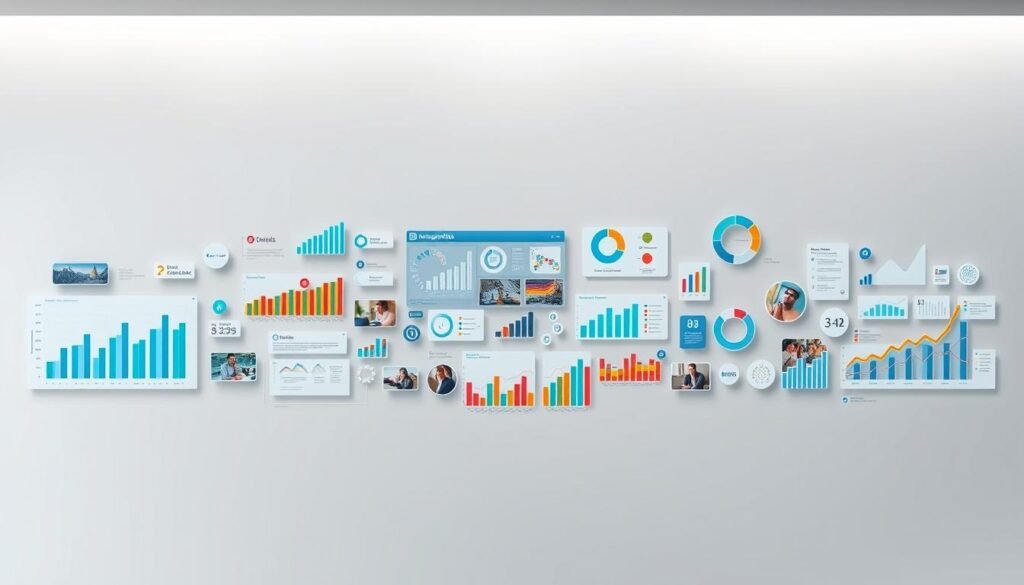
How can you make complex information easy to understand at a glance? Infographics and multimedia are powerful tools that simplify data and amplify your message. They not only save space but also enhance engagement by making your content more digestible and visually appealing.
Creating Engaging Infographics
Infographics are a great way to present statistics, processes, or ideas in a clear and concise format. Start by identifying the key points you want to convey. Use branded colours and fonts to maintain consistency and reinforce your identity. This ensures your visuals align with your overall value proposition.
Keep your design simple and focused. Avoid clutter by using ample white space and clear headings. Tools like Canva or Visme can help you create professional infographics even if you’re not a designer. Remember, the goal is to make complex information easy to understand at a glance.
Integrating Video Content Effectively
Videos are another excellent way to engage your audience. They allow you to tell stories, demonstrate processes, or share insights in a dynamic format. Native videos on platforms like LinkedIn tend to perform better than external links, as they keep users within the platform.
When creating videos, ensure they are optimised for both mobile and desktop viewing. Use an aspect ratio of 16:9 for widescreen compatibility. Keep your videos concise—ideally under two minutes—to maintain viewer interest. Incorporate your branded colours and fonts to maintain visual cohesion.
“Multimedia isn’t just about engagement; it’s about making your message memorable and impactful.”
By combining infographics and videos, you can create a more immersive experience for your audience. This not only boosts engagement but also improves information retention. For more tips on using multimedia effectively, check out this detailed guide.
Implementing Consistency Across All Platform Visuals

Why does consistency in your digital presence matter so much? It’s the foundation of a recognisable and trustworthy personal branding strategy. When your visuals are uniform across platforms, they create a seamless experience for your audience.
Adhering to brand guidelines ensures that your profile looks professional and cohesive. This not only builds trust but also makes your identity instantly recognisable. For example, global brands like Coca-Cola and Apple maintain strict visual standards, which contribute to their success.
Regularly updated style guides play a crucial role in keeping your personal branding fresh. They provide clear instructions on how to use colours, fonts, and logos. This ensures that every piece of content aligns with your identity.
Here are some actionable strategies to maintain consistency:
- Use the same colour palette and fonts across all platforms.
- Ensure your profile picture and banners follow the same design principles.
- Update your style guide regularly to reflect any changes in your brand.
“Consistency is the key to building a strong and memorable brand identity.”
By following these guidelines, you’ll create a cohesive look that resonates with your audience. This not only enhances your personal branding but also makes your profile more impactful.
| Platform | Key Visuals | Consistency Tips |
|---|---|---|
| Banner, profile picture | Use branded colours and fonts | |
| Posts, stories | Maintain a unified aesthetic | |
| Website | Header, footer | Align with social media visuals |
In summary, consistency across all platforms is a point that cannot be overlooked. It strengthens your personal branding and ensures your profile leaves a lasting impression.
Overcoming Common Visual Branding Challenges on LinkedIn

What’s stopping your professional profile from making the right impression? Many users face design and technical hurdles that can undermine their visual identity. From improper image resizing to inconsistent layouts, these issues can detract from a polished appearance. Addressing them effectively is key to standing out.
Troubleshooting Common Design Issues
One of the most frequent problems is image distortion. This often occurs when the size of your banner or profile picture doesn’t match LinkedIn’s recommended dimensions. To avoid this, ensure your banner is 1584 x 396 pixels and your profile photo is 300 x 300 pixels. High-resolution images (72 DPI) will also prevent pixelation.
Cropping is another issue, especially on mobile devices. Place key elements in the centre of your banner to ensure they’re visible across all screen sizes. Testing your visuals on multiple devices is crucial to maintaining a professional look.
Here are some practical solutions to common challenges:
- Use design tools like Canva or Adobe Spark to create and resize images accurately.
- Regularly review and update your cover images to ensure they align with your brand.
- Seek professional assistance if you’re unsure about design standards.
“Consistency in your visuals builds trust and reinforces your professional identity.”
Another challenge is maintaining a cohesive visual identity across all platforms. This includes using the same colour palette, fonts, and logo placement. A style guide can help you stay consistent and avoid discrepancies.
Finally, don’t underestimate the importance of regular updates. Trends change, and so should your visuals. By keeping your profile fresh, you’ll ensure it continues to make a strong impression. For more tips on overcoming common branding challenges, explore this detailed guide.
Conclusion
Your professional identity is shaped by the choices you make in crafting your online presence. By incorporating style guides, optimising images, and selecting the right colour palettes, you create a cohesive and memorable profile. Consistency in typography and the use of multimedia further enhance your story, making it easier for others to connect with you.
Attention to detail is crucial. A well-designed profile not only builds trust but also leaves a lasting impression. Applying these best practices ensures your professional presence stands out in a competitive digital space.
Regularly reviewing and updating your visuals keeps your profile fresh and aligned with evolving trends. A strategic approach to your online identity can elevate your personal brand and drive meaningful engagement. For more insights, explore this detailed guide on creating a strong brand identity.
FAQ
Why are visual elements important for my LinkedIn profile?
Visual elements help create a strong first impression, making your profile stand out. They reinforce your personal identity and communicate your professional message effectively.
How can I establish a cohesive visual identity on LinkedIn?
Start by creating a brand style guide. This includes consistent use of colours, fonts, and imagery that align with your professional identity and values.
What are the ideal dimensions for a LinkedIn banner and profile picture?
For a banner, use 1584 x 396 pixels. Your profile picture should be 400 x 400 pixels. Ensure both are high-resolution and optimised for both mobile and desktop views.
How do I choose the right colour palette for my profile?
Select colours that reflect your personality and align with your industry. Use tools like Adobe Colour to create a harmonious palette that enhances your profile’s appeal.
Why does typography matter for my LinkedIn profile?
Consistent typography reinforces your brand identity. It ensures readability and professionalism, making your content more engaging and easier to digest.
How can infographics and multimedia improve engagement on LinkedIn?
Infographics and videos make complex information easier to understand. They grab attention and encourage interaction, boosting your profile’s visibility.
How do I maintain consistency across all platform visuals?
Use the same colours, fonts, and design elements across your profile, posts, and other platforms. This creates a unified and recognisable brand presence.
What are some common visual branding challenges on LinkedIn?
Issues like poor image quality, inconsistent design, or cluttered layouts can weaken your profile. Regularly review and update your visuals to maintain a polished look.
Source Links
- Make Your Brand Unforgettable with Customer-Centric Design — Soley Creative Design Studio | Branding • Websites • Creative
- The new rules of LinkedIn – Daily Trojan
- Website Branding Elements for Online Stores
- Branding guide and tips for small business and entrepreneurs
- The Power of Visual Content – Boosting Engagement with Graphic Design
- Why A Consistent Brand Strategy Is Key To Success In 2025
- The Brand Awakens: Online Awareness Tactics
- Social Media Image Sizes – The Complete Guide
- The Overlooked Key to Engagement: Thumbnails on LinkedIn – VaynerMedia
- LinkedIn Background Banner: Universal Steps for Perfect Design
- Website Branding Elements for Online Stores
- The Power of Digital Marketing: Building Brands and Driving Success in the Digital Age
- 12 Best LinkedIn Tools for Growing an Audience (Tested)
- Website Branding Elements for Online Stores
- How To Optimise Your Brand Logo For Better Marketing – 2025
- The Psychology Behind Legal Branding: How to Make Clients Choose You – Grow Your Law Firm
- Storytelling in Marketing: narratives that captivate and convert
- The Role of Content Marketing in SEO: How to Rank Higher
- SEO for Higher Education: Boost Visibility & ROI | Victorious
- Beyond The Textbook: Unconventional Approaches To Data Visualization In Business Analytics | Online Courses | SIIT
- Building Trust: The Importance Of A Consistent And Seamless Brand Experience | Ecommerce Fastlane
- Web Design & Marketing Agency | Brand Vision
- What an Animated Video Agency Can Do for Your Brand
- UX & Usability Articles from Nielsen Norman Group
- The Ultimate Guide to Content Marketing for Law Firms in 2025 | JD Supra
- Building a Strong Digital Presence for Your Life Sciences Brand
- Content Optimization for SEO & Marketing Success